WEEK 1: Neal Gillis
Neal here,
Seems as though Kristi has explained our week plan fairly well. My personal priorities for the week are:
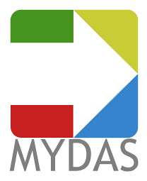
 I threw this logo together Friday afternoon. Personally, I don't have any great feelings for it. If all y'all don't enjoy it, it can be changed, dropped, ripped up, whatever. My original thought for a logo was a huge flaming falcon with slab of marble in it's claws with "MYDAS" chiseled on the rock. After thinking about it, I produced this instead. The arrow represents moving forward, while the four coloured shapes that make up the arrow represent the four Atlantic provinces. The green one is NB (for it's forests), red for PEI (it's red soil), blue for NS (on the sea), and yellow for NFLD (as it's the first province to see the sun everyday). I chose gray text as it just looks nicer with those colours. Cheesy, I know, but it might look more professional than the flaming falcon. We can put it on business cards, PowerPoints, documents, t-shirts, whatever. If you have any comments please comment. I won't be the least bit offended.
Anyway folks, I hope everyone has a great week. Probably talk to you soon!
Seems as though Kristi has explained our week plan fairly well. My personal priorities for the week are:
- Get our summer planned out, week by week
- Talk to people on campus about getting Kristi and I a permanant office
- Working on the blog (getting relevant links up, putting the documents up, etc.)
- Figuring out the payroll situation
 I threw this logo together Friday afternoon. Personally, I don't have any great feelings for it. If all y'all don't enjoy it, it can be changed, dropped, ripped up, whatever. My original thought for a logo was a huge flaming falcon with slab of marble in it's claws with "MYDAS" chiseled on the rock. After thinking about it, I produced this instead. The arrow represents moving forward, while the four coloured shapes that make up the arrow represent the four Atlantic provinces. The green one is NB (for it's forests), red for PEI (it's red soil), blue for NS (on the sea), and yellow for NFLD (as it's the first province to see the sun everyday). I chose gray text as it just looks nicer with those colours. Cheesy, I know, but it might look more professional than the flaming falcon. We can put it on business cards, PowerPoints, documents, t-shirts, whatever. If you have any comments please comment. I won't be the least bit offended.
Anyway folks, I hope everyone has a great week. Probably talk to you soon!
 MYDAS is a program designed for youth across the Atlantic region to develop the skills needed to aid in community economic development.

0 Comments:
Post a Comment
<< Home